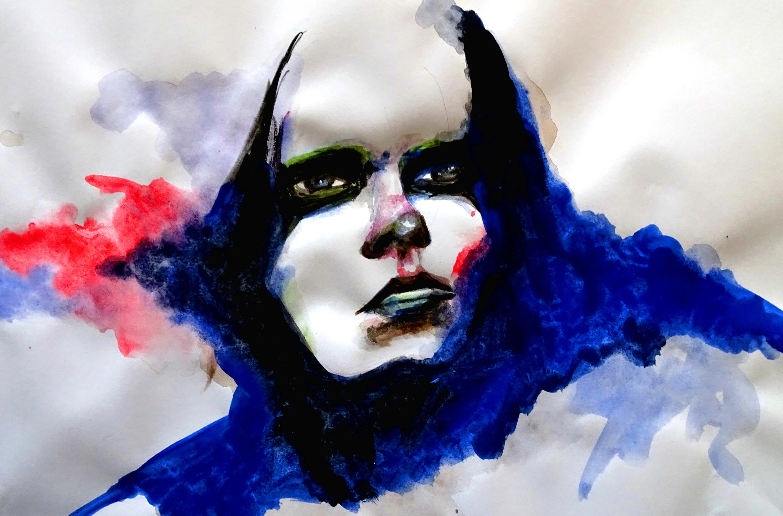
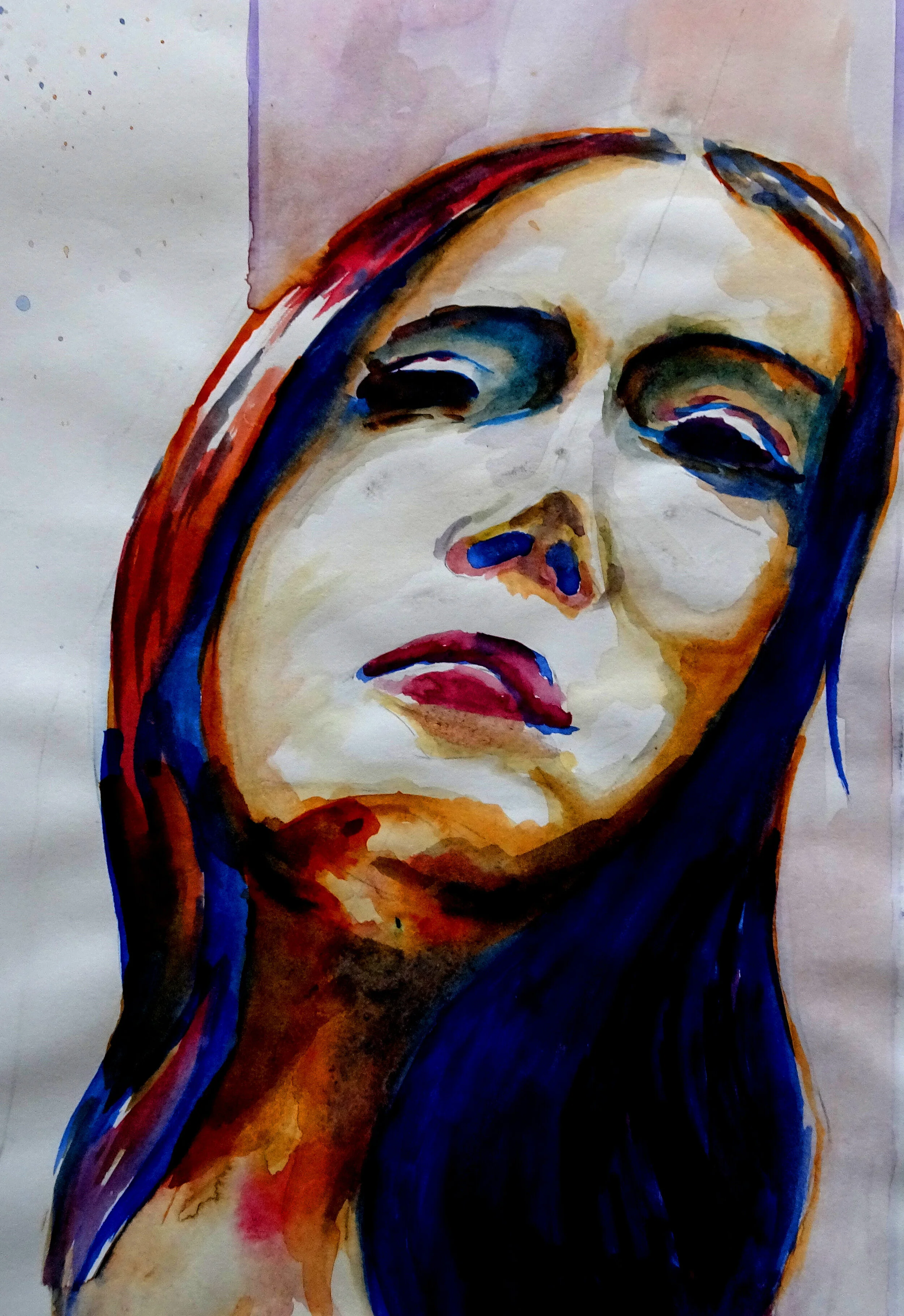
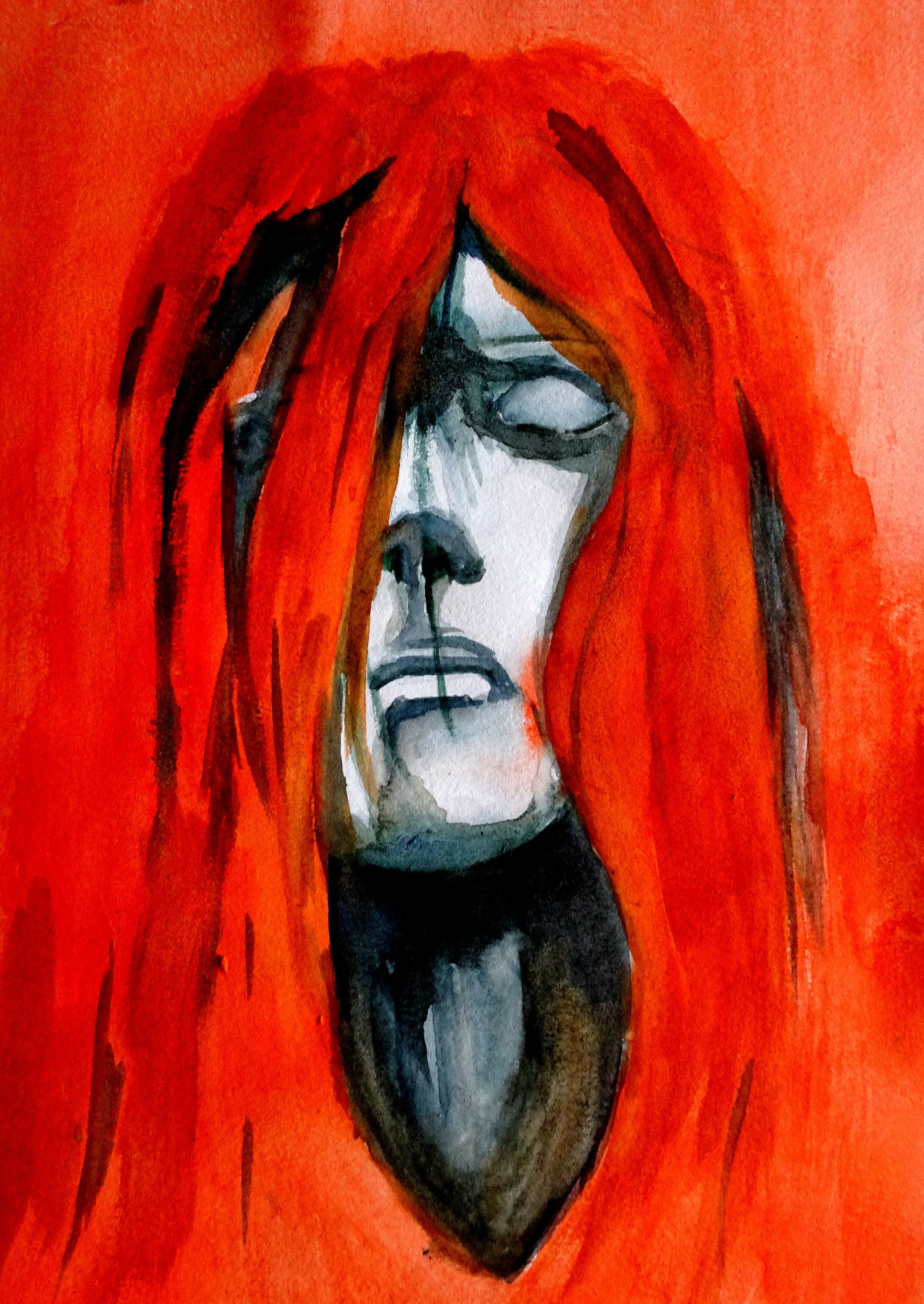
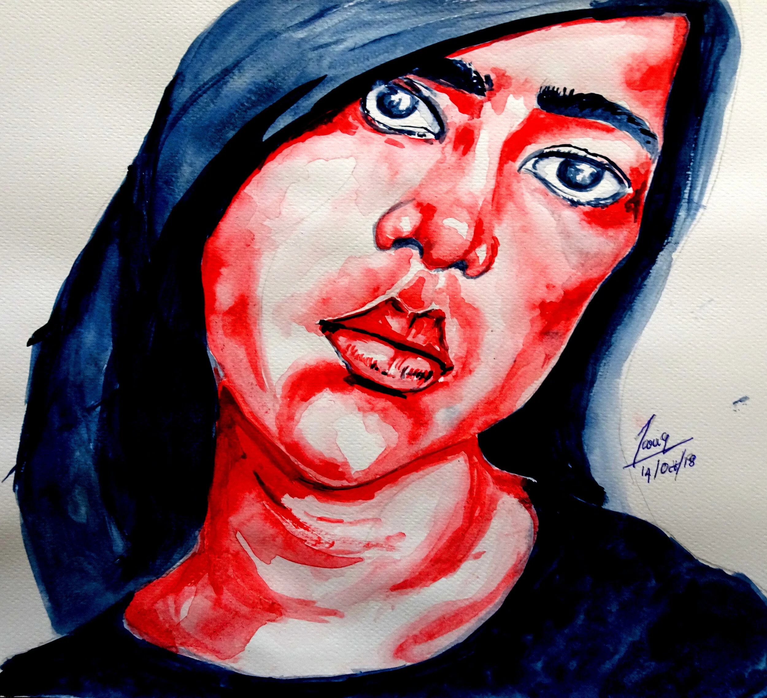
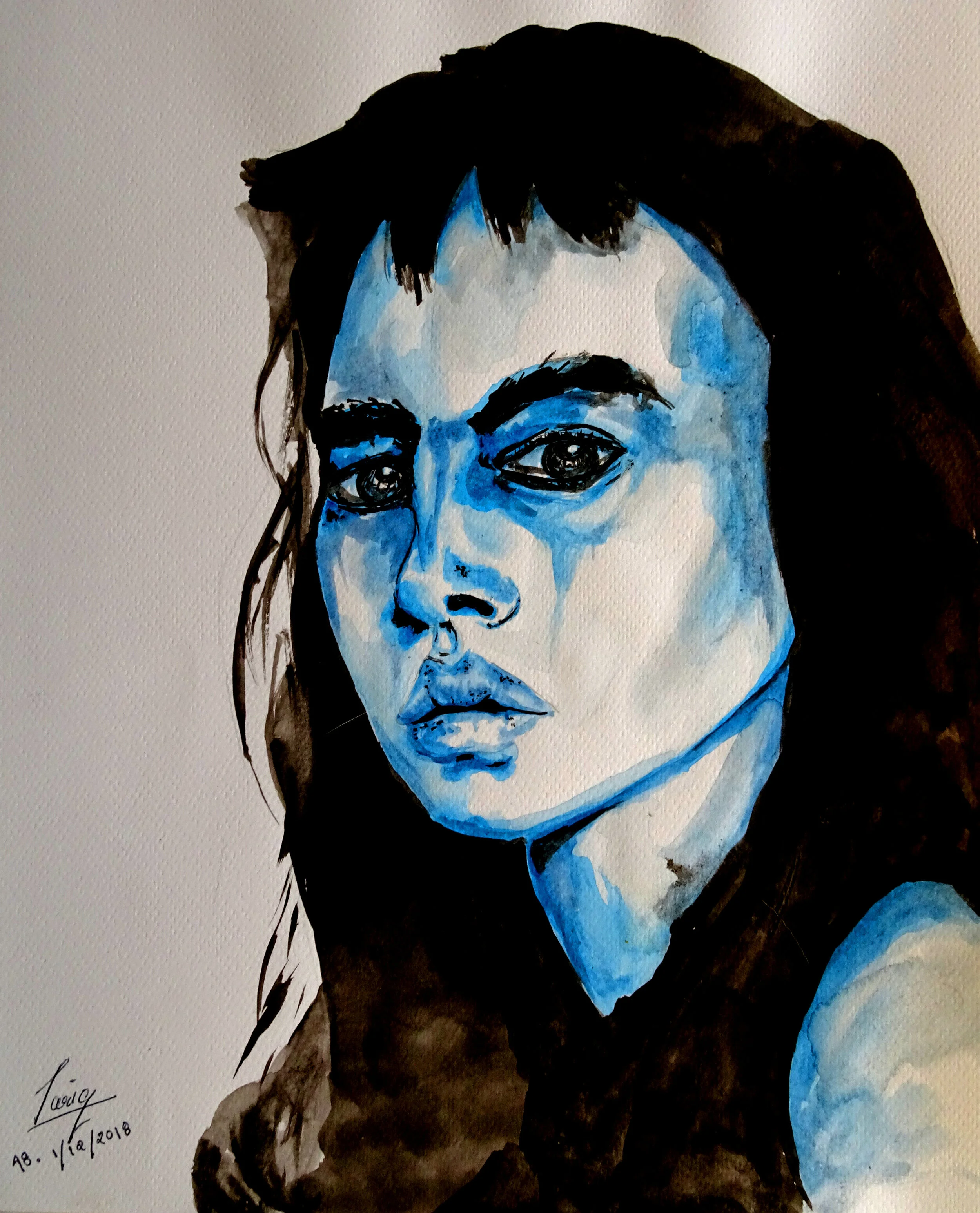
Red & Blue
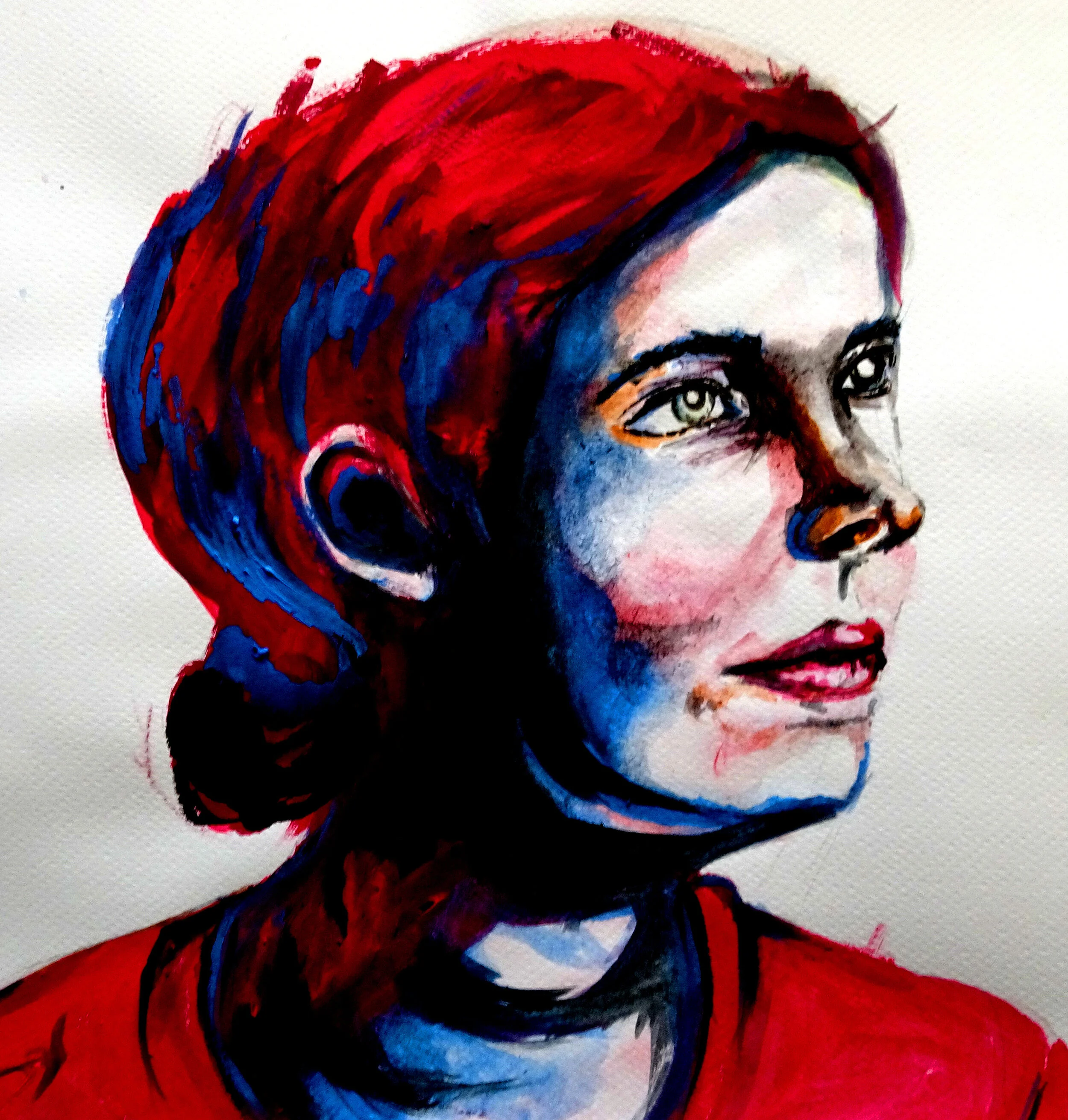
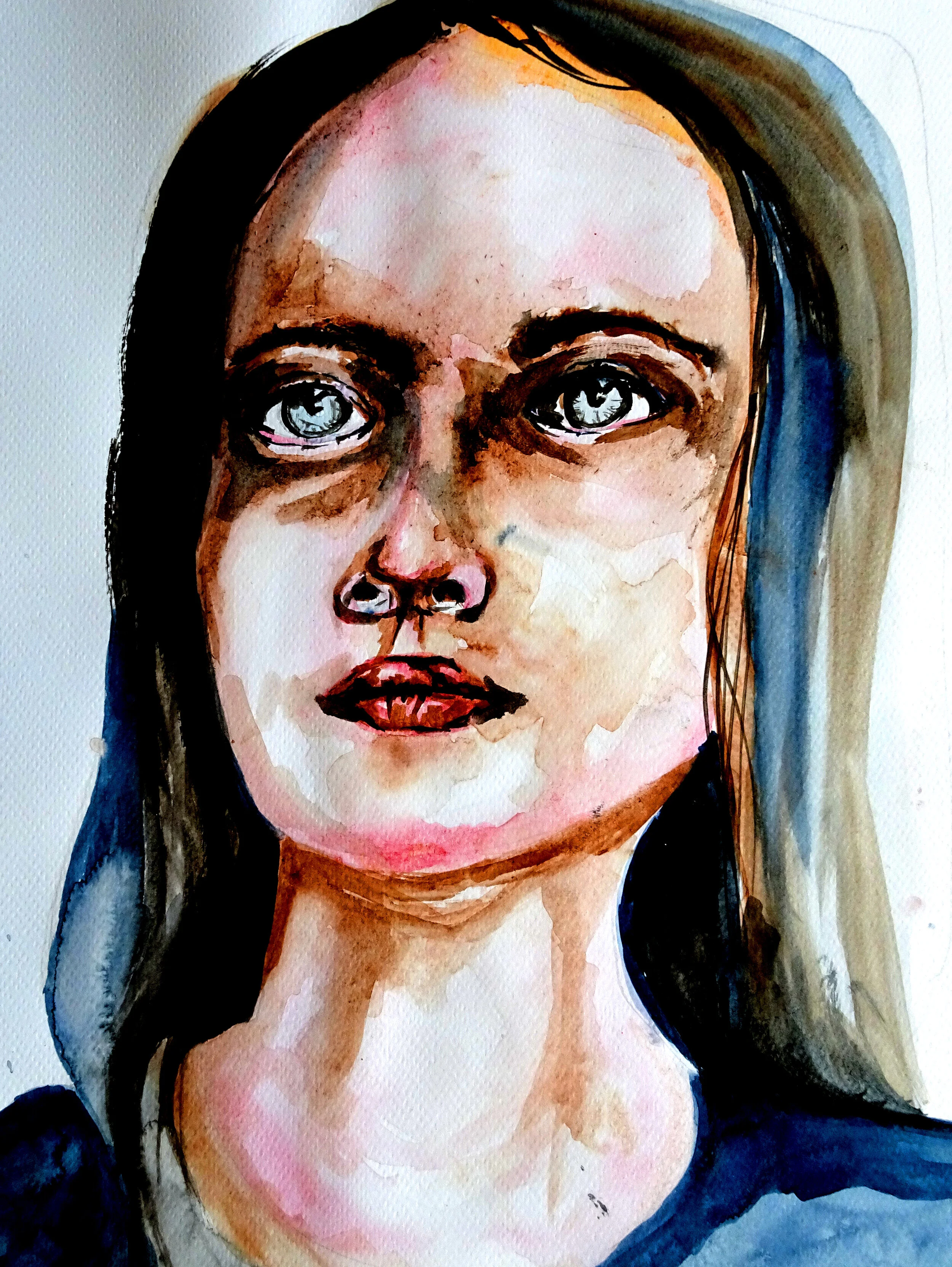
Its been some time since I revisited some of my paintings and a big theme of my work back then was drawing portraits. At this time I was in a dilemma of how to make my work more interesting. I was getting fairly good at drawing faces, however, it was getting quite repetitive. I was working on drawing other things but it would be some time yet before I got good. I started experimenting with making my portraits using a limited color palette. The motivation for this came from my laziness towards cleaning my painting palette (a metal box I use to smear and mix paint). I already had paint on it that I didn’t want to throw away. I started with making black and white portraits, but quickly switched to reds and blues. The colors compliment each other and build contrast in the final image.
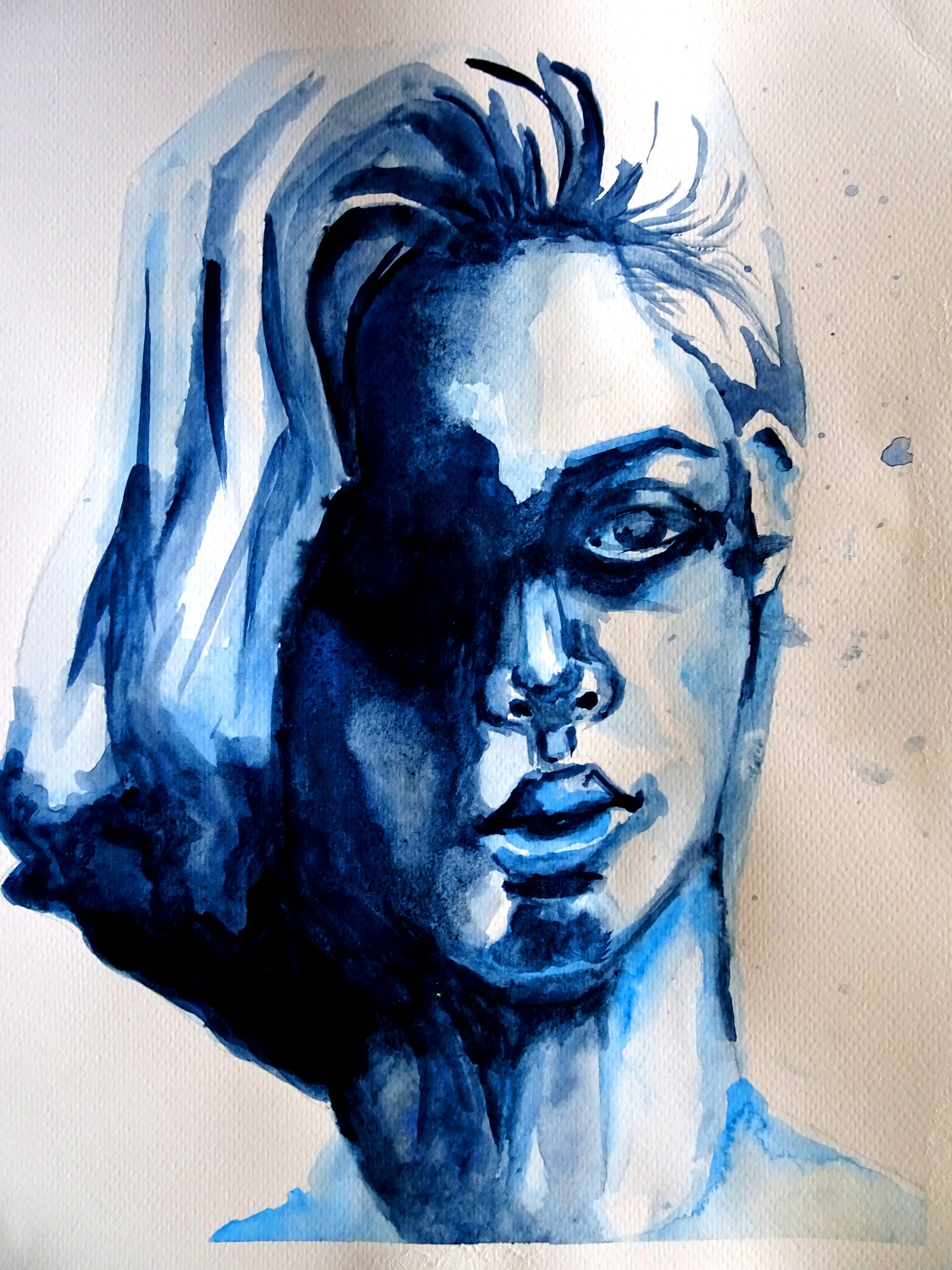
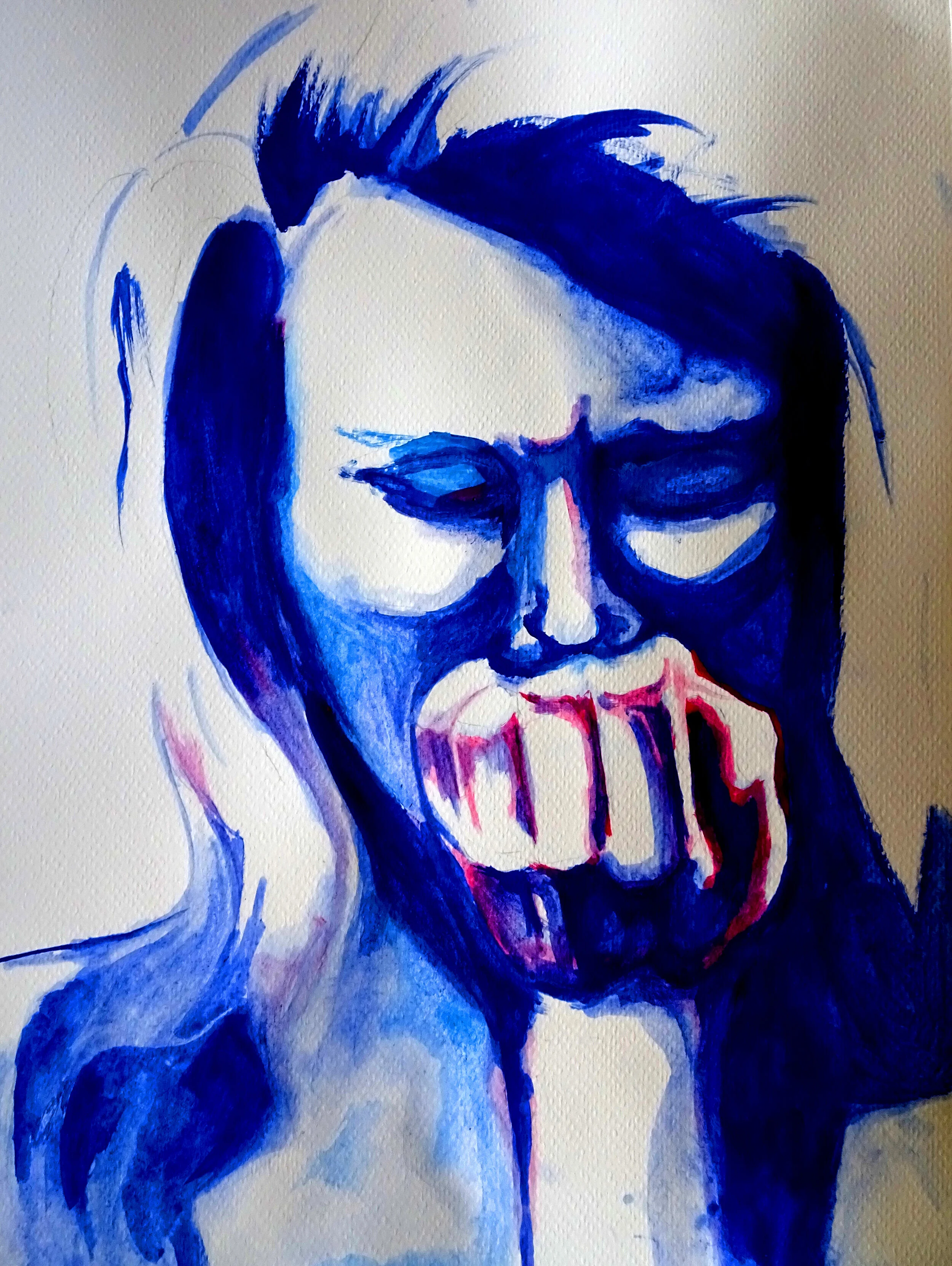
Blue is for melancholy and red is for intensity. The mix of colors were intended to embody these feelings in the portraits. It is however difficult for me to determine if the mood of the painting is altered by the colors used. The trivial answer is of course, Yes! that color make a huge difference. But from the perspective of using the colors, how does coloring a certain part of the face blue/red convey a specific emotion?
My approach to painting is not to treat it as a science. The method in which I evaluate a painting or try to understand its meaning is very subjective. I do not think there is any specific formula to gauge the quality of a painting. I like to work in an organized manner with my principal goal being that I continue the process and not give up. In order for that to work for me, I require things to be low effort to get into. In this context that means, I try to make a lot of diverse paintings and reflect on them as opposed to figuring things out before I start.
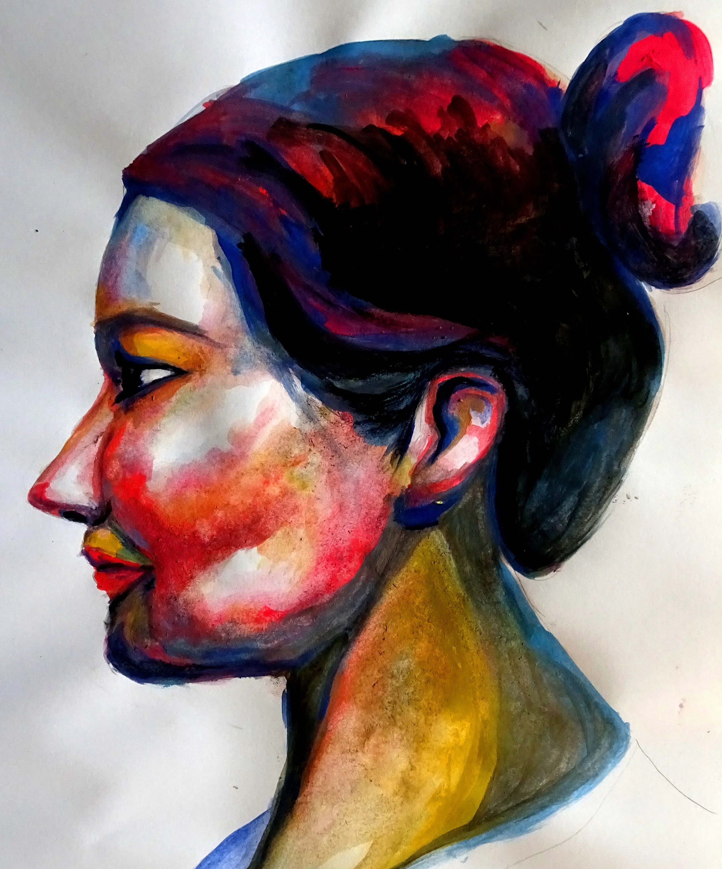
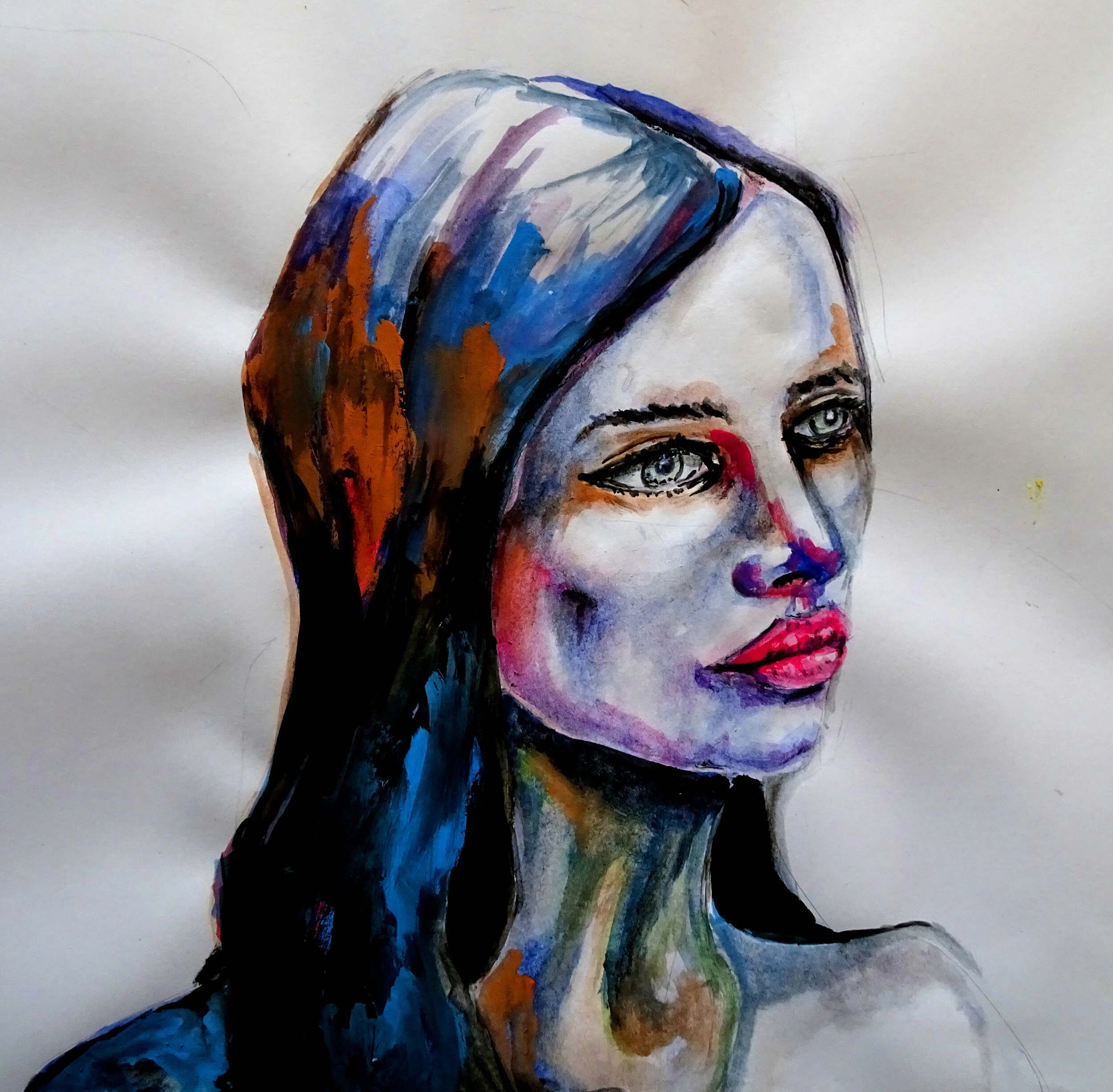
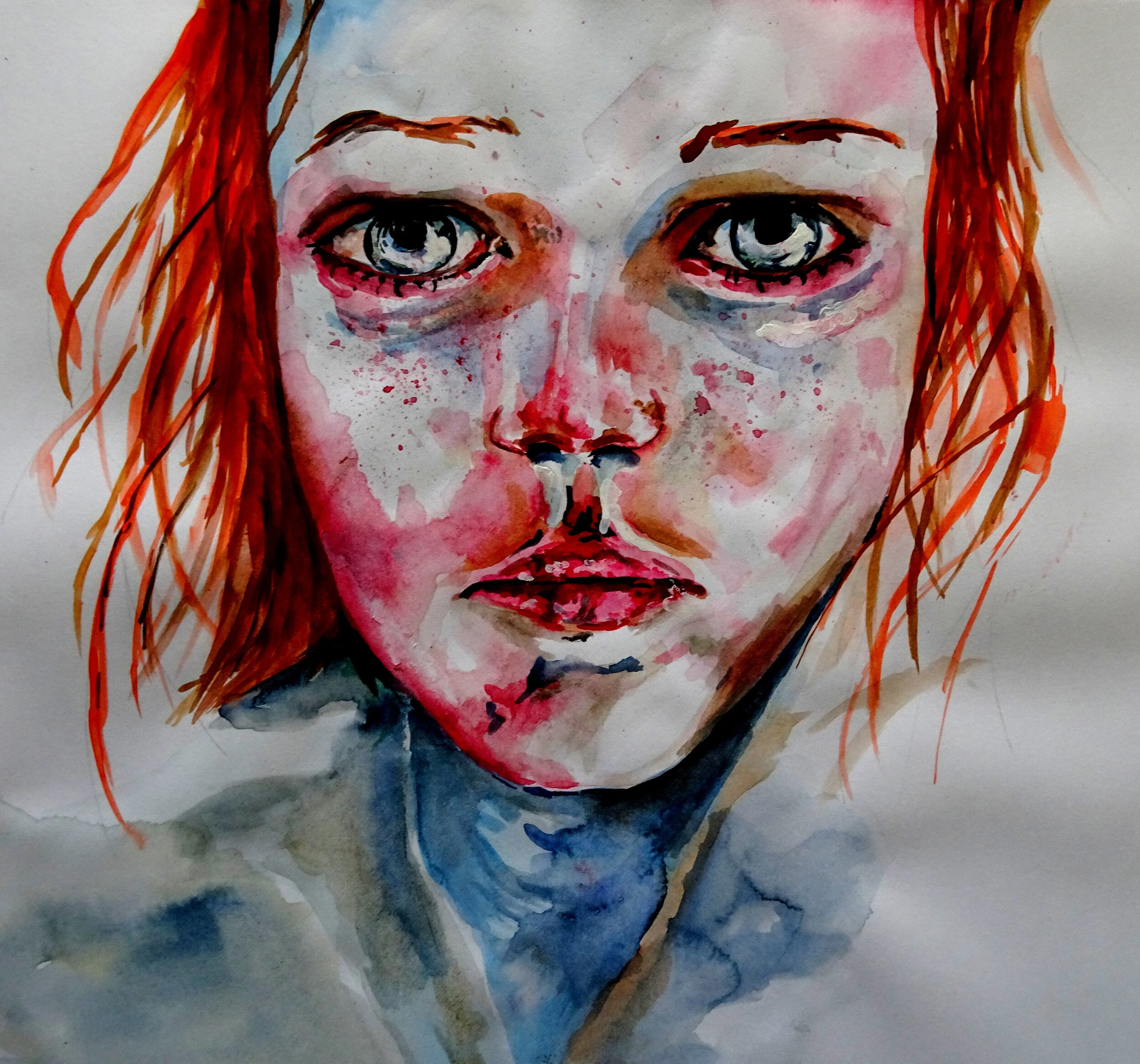
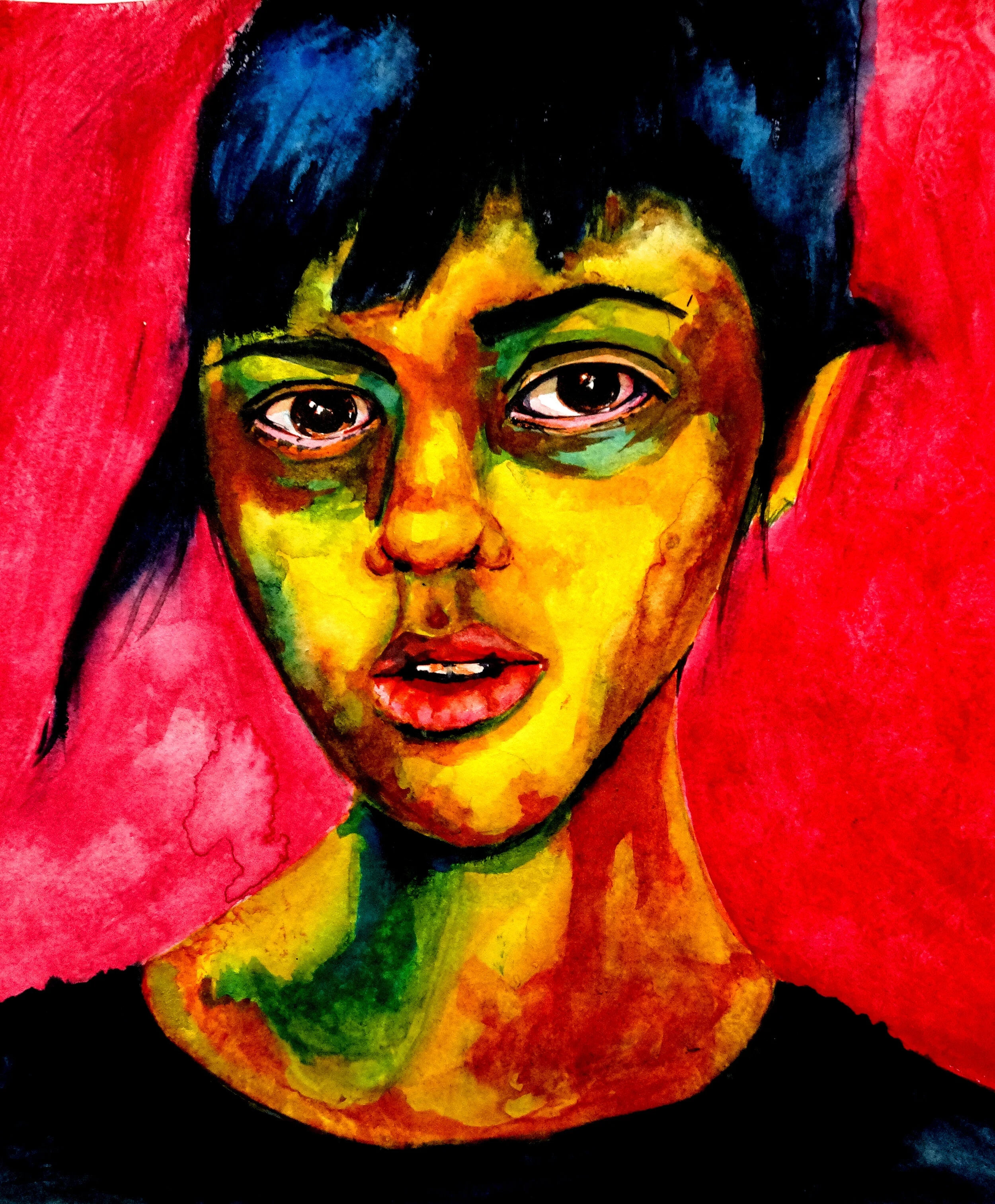

I don’t really have any answers about how mood is influenced by color. I can imagine a lot of my paintings would work just as well in a different color scheme. I can only say that it was an interesting idea to experiment with. I did however learn a lot more about the colors that I used. While the specifics still elude me, intuitively I feel I have a better idea of identifying what colors would work in a particular portrait.